Synopsis
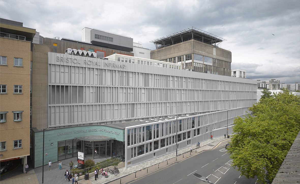
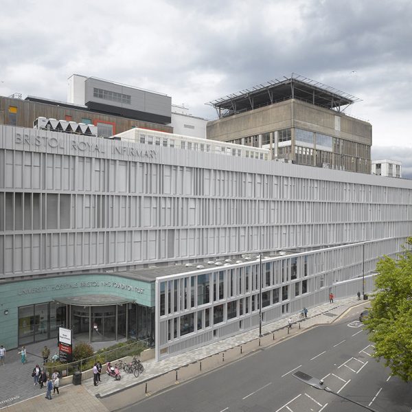
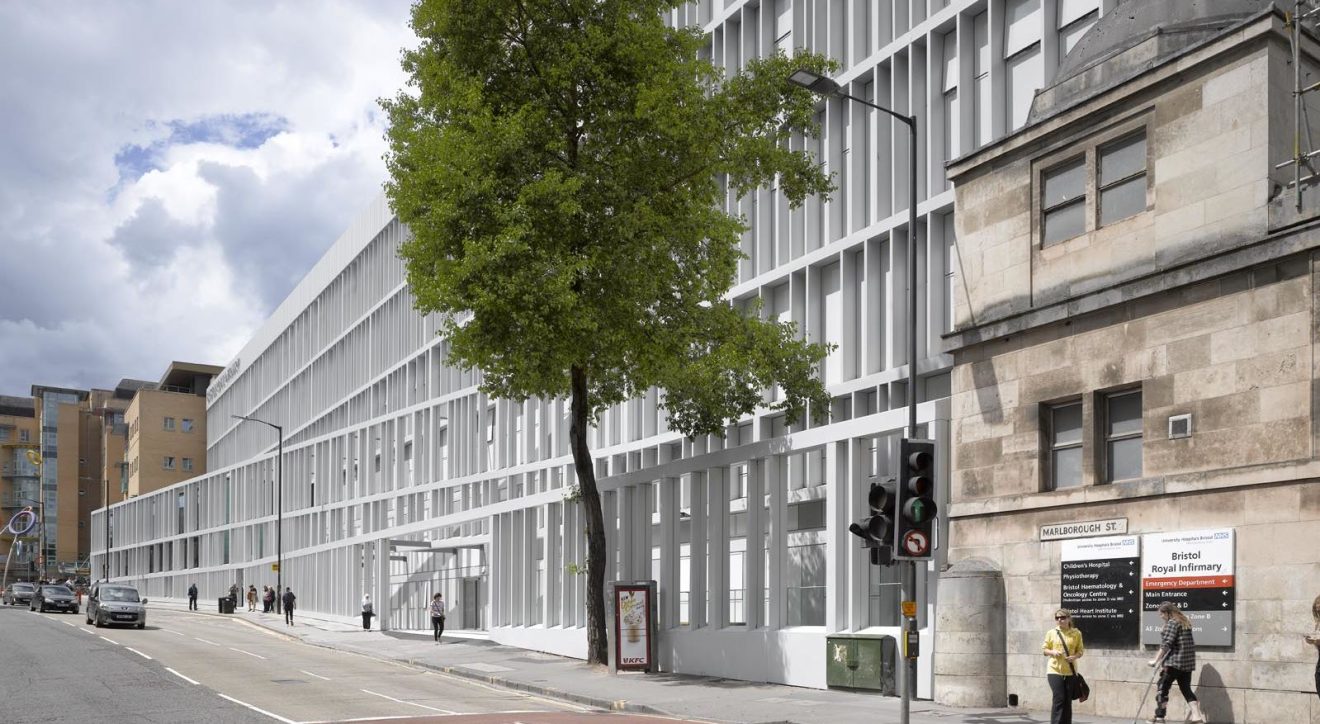
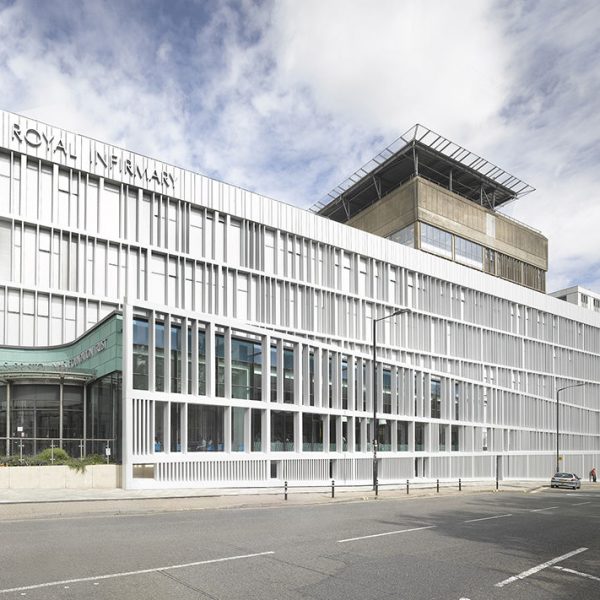
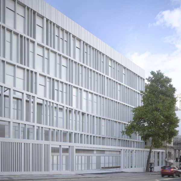
During the summer of 2016 work to improve the main facade of Bristol’s Royal Infirmary (BRI) – once voted the ugliest in Bristol – was completed, transformed by the addition of an elegant aluminium and glass skin. The redesign which formed part of a £92 million redevelopment of the hospital, also included works to create a new Ward block, Welcome Centre and Helideck.
"Façade and building enter a dialogue in which it is no longer easy to discern who is subject to who, the part or the whole.”Nieto Sobejano
Description
The facade design, named “Veil”, by Spanish architects Nieto Sobejano Architectos, was the winner of an international design competition held by University Hospitals Bristol NHS Foundation Trust, which runs the BRI. The competition for the building façade was developed with the involvement of Bristol based art consultants Willis Newson who were commissioned by the trust in 2011 to develop a shortlist of artists and designers to develop proposals for the building.
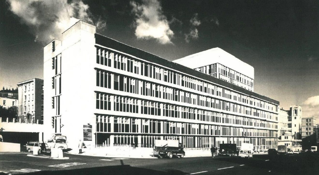
Enhancement of the existing 1965 Wakins Gray block provided an opportunity to address number of environmental and maintenance issues as well as providing an opportunity for the Trust to develop and portray its brand to reflect the excellence of the clinical care it provides. Willis Newson put together a shortlist of six; three artists (Daniel Burren (France), Luke Jerram (UK) and Anthony Malinowski (Poland)) and three architectural practices (Nieto Sobejano, (Spain), Tham and Videgard, (Sweden) and So-Il, (New York)
Concepts were developed by all six practices and – after much public consultation including displays in the hospital and front page coverage and an online poll run by the Bristol Evening Post – three practices from the longlist were selected by the project steering group to take their designs to the next stage.
All three architects’ practices made it through to the second stage of the competition and feedback on final designs was sought from the public at consultation events in the hospital and in the city shopping centre, as well as at an exhibition at the Architecture Centre in Bristol. Public involvement created a sense of excitement and anticipation beyond the immediate hospital community and helped to fuel momentum for the project.
The winning design selected was by Madrid-based practice Nieto Sobejano. Called Veil, the structure was developed in partnership with local architects CODA led by Craig Bennett, installed by DB Facades and unveiled in June 2016.
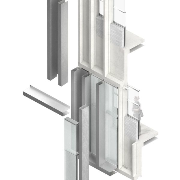
To address the technical requirements a new building envelope comprising insulated aluminium rainscreen and integrated high-performance windows which combines all the technical requirements : a highly thermally efficient window system ; enhances the insulating layer ; increases its acoustical performance, and ensures complete watertightness.
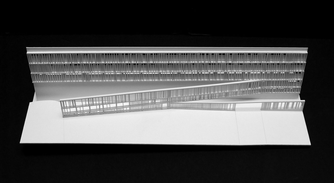
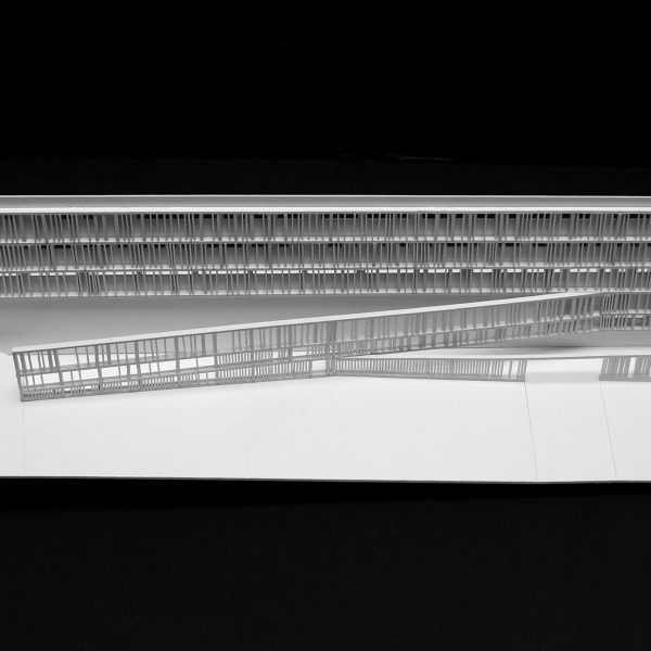
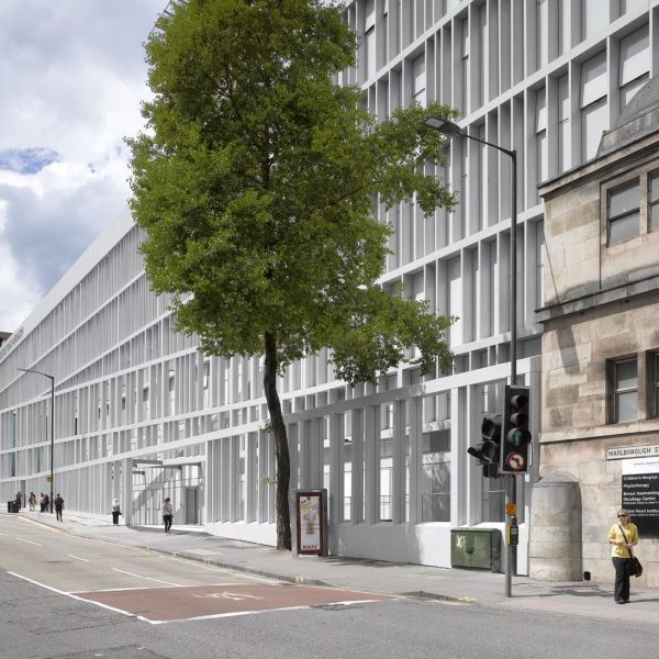
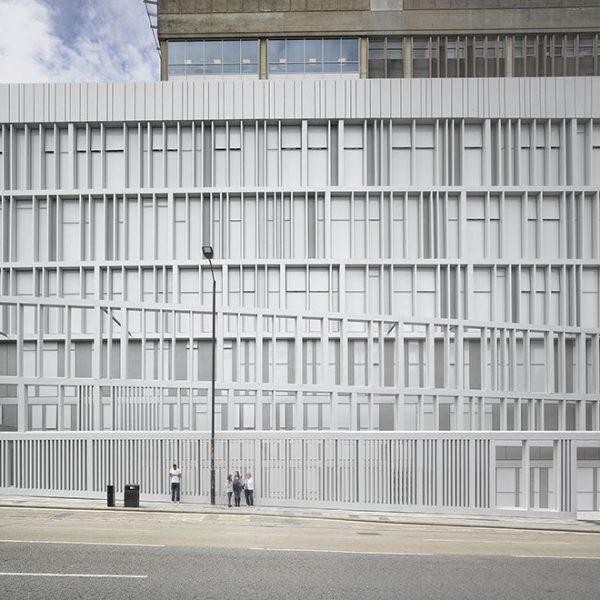
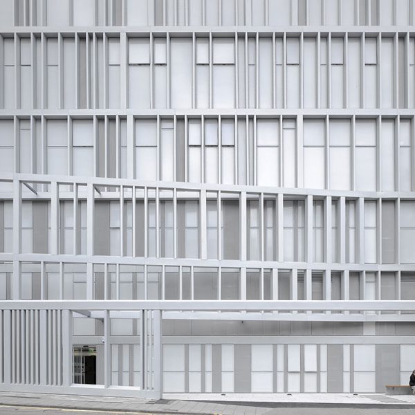
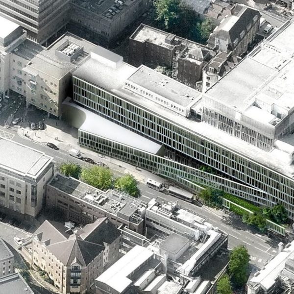
The facade is a striking modern skin over the top of the existing structure, made of powder-coated aluminium and glass which provides a maintenance-free, energy-efficient new frontage for the hospital. It sweeps across the existing face of the BRI, linking the recently added Welcome Centre extension into the main building to create a unified whole. The rhythm of the new screen by Nieto Sobejano echoes and respects the vertical rhythm of the old 1970s concrete frontage.
An integral lighting installation is central to the façade vision. To enhance the façade a new layer of light within the façade depth was created. As the architecture takes advantage of the previous non-uniform window arrangement, by changing it into an attractive random like pattern of vertical elements, the lighting proposal selects just a fraction those vertical elements to be highlighted with a vertical storey-height LED light strip.
This random-like design strategy suggests a kind of subtle dynamism that allows the lighting installation to implement a dynamic solution for special days or events, when a third of the lighting units will be on at a time in a continuous dimming loop.
The lighting dynamics, loop timing and fading sequences are extremely quiet, distinctive and elegant to complement the architecture of the new façade and to emphasise the extremely clear hue of the composite panels to bring into the night scene the feel of cleanliness there is during daytime.
To address the functional and spatial requirements, the small open garden which redefines the public realm to provide a new sense of welcoming and non-threatening environment mediates between the Queens Building and Upper Maudlin Street.
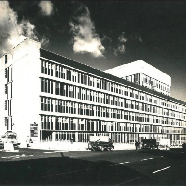
“Designing a new façade for an existing building may seem contradictory to a comprehensive and unitary conception of architecture. It may also raise doubts about the unity of the architectural work and even its authorship. However, these circumstances are not so strange to a discipline, architecture, that unlike other arts, has always accepted the possibility of being expanded or modified in the course of time. The project of a façade for the Bristol hospital offered the opportunity to reset the relationship between the part and the whole, the unity and the fragmentation, and between the initial intentions of the author and the contingencies that affect the life of the buildings. The Bristol Royal Infirmary is a complex with multiple pavilions and extensions built over time. The former 18th century hospital was expanded in 1911 with a large limestone building in an “E”-shaped plan. In 1965 a second expansion characterized by an expressive rhythm of prefabricated concrete elements completed the façade towards the Upper Maudlin Street. A somehow “brutalist” aesthetic in the treatment of the material coexisted with the compositional order of vertical pieces that gave lightness to the ensemble. However, the poor state of conservation and several unfortunate additions – such as a new welcome center and the mechanical installations on the roofs – significantly distorted the original architecture. As result of a restricted competition between three artists (Daniel Buren, Luke Jerram and Anthony Malinowski) and three architects (Tham and Videgard, So-Il and Nieto Sobejano) – our proposal did not intend to radically change the original image of the building, but rather to transform it following the same geometrical law which had generated it. We limited ourselves to wrap the existing grid with white aluminum profiles, thus solving the technical problems of the façade. Like a veil that adheres and separates from the skin, the new lattice display comes off the façade creating interstitial public spaces that suggest a new relationship between the hospital and its urban context. Façade and building enter a dialogue in which it is no longer easy to discern who is subject to who, the part or the whole.” (Nieto Sobejano)
Nieto Sobejano Arquitectos was founded in 1985 by Fuensanta Nieto and Enrique Sobejano and has offices in Madrid and Berlin. Along with being widely published in international magazines and books, the firm’s work has been exhibited at the Biennale di Venezia in 2000, 2002, 2006, and 2012, at the Museum of Modern Art (MoMA), New York, in 2006, at the Kunsthaus in Graz in 2008 and at the MAST Foundation in Bologna in 2014. They are the recipients of the 2007 NATIONAL PRIZE FOR CONSERVATION AND RESTORATION OF CULTURAL HERITAGE AND THE 2010 NIKE PRIZE ISSUED BY THE BUND DEUTSCHER ARCHITEKTEN (BDA), AS WELL AS THE AGA KHAN AWARD FOR ARCHITECTURE (2010), THE PIRANESI PRIX DE ROME (2011), THE EUROPEAN MUSEUM OF THE YEAR AWARD (2012), THE HANNES MEYER PRIZE (2012), AIA HONORARY FELLOWSHIP (2015) AND THE ALVAR AALTO MEDAL IN 2015. Their major works include the Madinat al-Zahra Museum, the Moritzburg Museum, the San Telmo Museum, the Zaragoza Congress Centre, the Joanneum extension in Graz, and the Contemporary Art Centre in Córdoba. Nieto Sobejano Arquitectos currently have projects in Germany, Spain, Austria, Estonia, Morocco, China and United Kingdom. Two monographs have been recently published about their work: “Nieto Sobejano. Memory and Invention” (Hatje Cantz Verlag, Ostfildern, Germany, 2013) and “Fuensanta Nieto, Enrique Sobejano. Architetture” (Mondadori Electa Spa, Milano, Italy, 2014).
Willis Newson is a leading Bristol-based independent arts consultancy specialising in creative approaches to improving health and wellbeing. It develops & delivers public art strategies for new builds and refurbishments, manages public engagement programmes, offers an affordable design service for healthcare and provides advice and guidance on using art & design to create healthy environments.
Willis Newson was established in 2001 and has since carried out over 200 projects for more than 31 NHS Trusts, as well as working on projects for private healthcare clients, contractors and architects.
CODA Architects was formed in 1994 and is recognised for designing intelligent, well-crafted Architecture and the incorporation of Art.
The studios work ranges from tiny, temporary use buildings to large scale urban projects and we take an ethical approach to everything we do; from designing our buildings to running our business, with carefully detailed designs underpinned by collaborative processes, a commitment to sustainability, innovation and finding optimum design solutions.
We chose Bristol as our base because of its history and vitality and are committed to supporting our local business and design communities by working with local organisations, such as Forum for the Future, Creative Common, The Bristol Shakespeare Festival Theatre and by sponsoring a Graphic design prize at UWE. Please see the link below for examples of work by this year’s winner Harriet Murray.
Our spirit of curiosity and experimentation is reflected not only in our designs but our own research projects on topics of interest to us; Links to a couple of examples of such projects can be found below.
The University Hospitals Bristol NHS Foundation Trust runs Bristol Royal Infirmary and Bristol Royal Hospital for Children, Bristol Eye Hospital, South Bristol Community Hospital, Bristol Haematology and Oncology Centre, St Michael’s Hospital and the University of Bristol Dental Hospital, in Bristol, England.
The Trust has over 8,000 staff who deliver over 100 different clinical services across nine different sites. With services from the neonatal intensive care unit to care of the elderly, we provide care to the people of Bristol and the South West from the very beginning of life to its later stages.
UH Bristol is one of the country’s largest acute NHS Trusts with an annual income of half a billion pounds. We provide general hospital services to the population of central and south Bristol and the north of North Somerset – a population of about 350,000 patients. The Trust provides specialist services to a wider population throughout the South West and beyond, serving populations typically between one and five million people.
As a University Teaching Trust, we place great importance on teaching and research. The Trust has strong links with both of the city’s universities and teaches students from medicine, nursing and other professions allied to health. Research is a core activity and the Trust is a full member of Bristol Health Partners, and of the West of England Academic Health Science Network, and also hosts the recently established Collaboration for Leadership in Applied Health Research for the West of England.
