2023
Tower Lane Brass Inset Paving, Former Everard’s Printworks
Synopsis
This distinctive surface artwork on Tower Lane draws inspiration from Bristol’s historic letterpress trade. The design incorporates traditional printing expressions once commonly used by printers at the former Everards Printworks on Broad Street. Over time, many of these phrases have evolved into everyday language—bridging past and present in a subtle tribute to the city’s rich industrial heritage.
The artwork celebrates the thousands of Bristol residents who worked in the printing industry, especially in letterpress. By embedding these historical references into public space, the project brings new visibility to a craft that helped shape the city’s creative and cultural identity.
Delivered by The Department of Small Works, founded by Nick Hand, the project reflects a deep commitment to preserving traditional printmaking. Since 2013, the Department has run a working letterpress print shop, where participants learn to set type by hand and operate vintage presses. Through workshops and creative collaborations with poets, musicians, and artists, the Department keeps the spirit of letterpress alive—passing its stories and techniques to new generations.
Tower Lane, part of Bristol’s historic Old City, was once a hub for this skilled trade. As you walk along the lane, you’ll spot letterpress-inspired phrases embedded in the pavement. The fonts used were carefully selected to match those once used by Everards, a local jobbing printer that produced tram timetables, technical manuals for the Bristol Aeroplane Company (BAC), and many everyday printed materials.
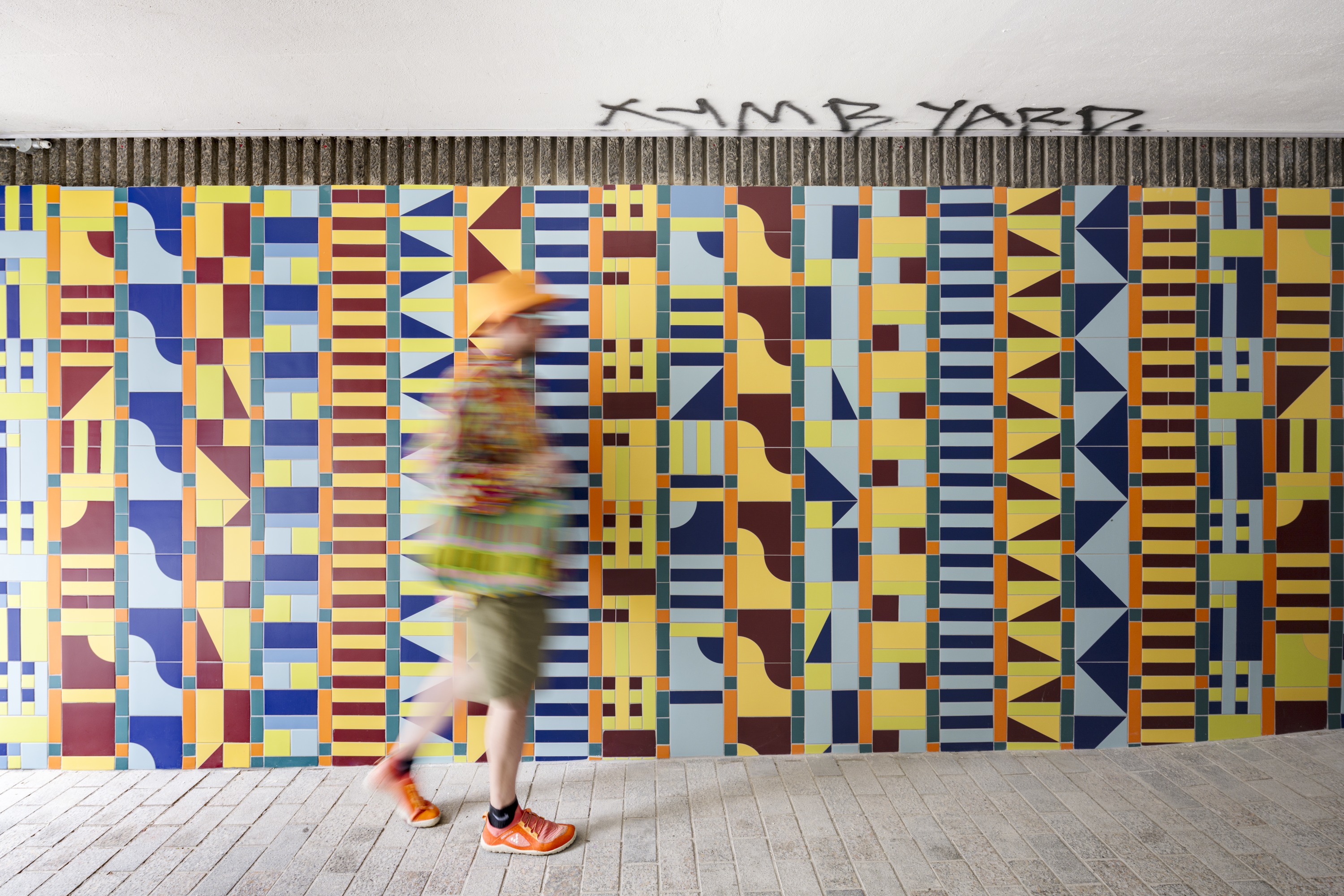
This project formed part of a programme of Public Art works commissioned by Artisan Landscapes to mark the re-development of the building. The programme included works by the following artists: Inkie – the repainting of his ‘See no evil’ mural on Nelson Street and Adam Nathaniel Furman’s ‘Bristol Quilt’ tile installation.
Here are the phrases and their original meanings:
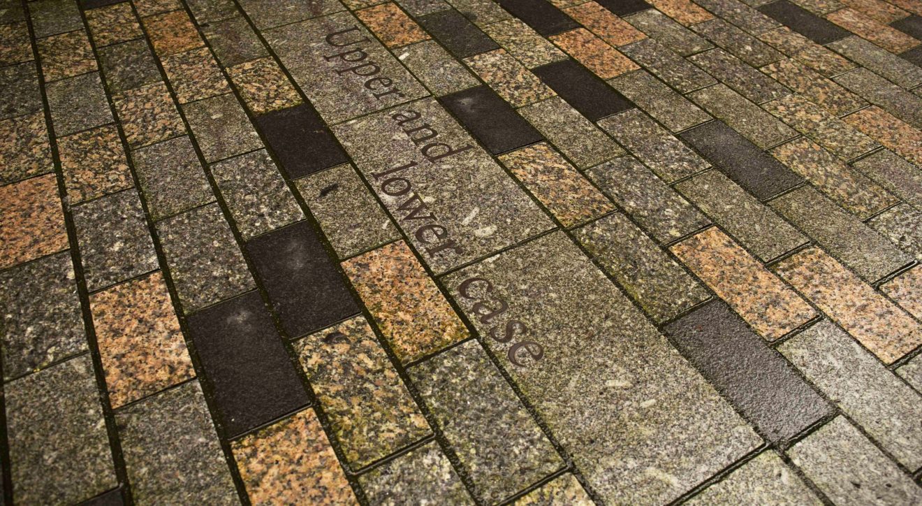
Upper and Lower Case
The type case was key to letterpress. The case was the equivalent of our computer keyboard. It was laid out for efficiency and each area contained a set of one letters (a sort). So the most common letters (vowels) are central near where your hands sat and also the biggest areas as you would use more. Originally the there were two cases one for capitals and one which sat below it for lower case, hence upper and lower case.
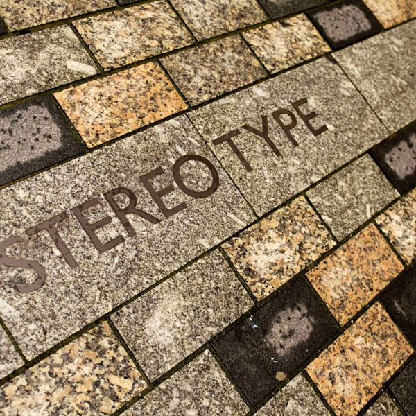
Stereo type
In the days of Everards as a letterpress printing company, lead type was set by hand and if a job, such as an advertisement was used more than once, the compositor (who set each letter by hand) may decide to make a stereotype, a moulded copy that would be kept for reprints.
A dab hand
Printers used a ‘dab’ to apply ink onto the letter blocks until they were ready to be applied. Whoever had the job to make sure there was even coverage of the letters with the mushroom shaped instrument was thus graced the title of ‘dab hand’, hence our common use of someone skilled at a certain ability.
Make a good impression
Good letterpress printers have a different idea of what a ‘good impression’ might be. For them it is kissing the paper with lead or wood type evenly and lightly so that ink is evenly and perfectly applied. You can see how ‘Make a good impression’ has come into common parlance as a definition of being the best you can be.
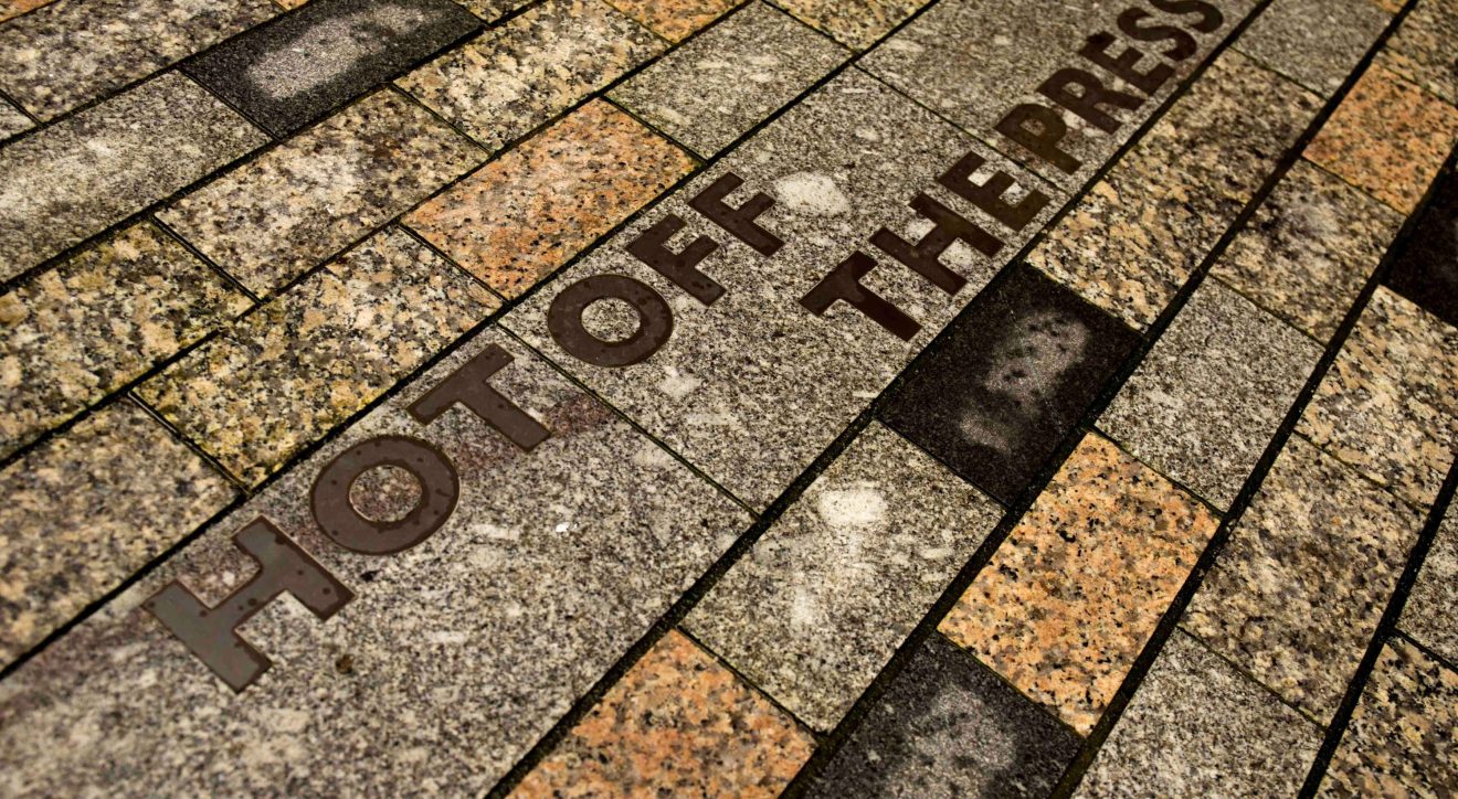
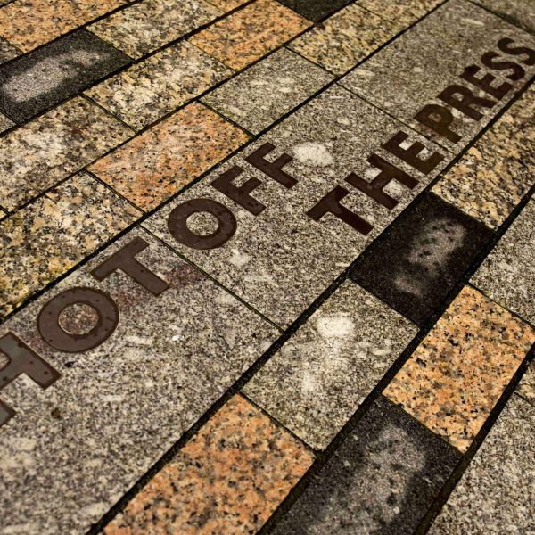
Hot off the press
Newspapers used to be made by the ‘hot metal printing’ process from pouring molten lead into the printing block moulds. The hot newspapers were then distributed, with the first readers grasping the juicy stories before anyone else, leading to its more common meaning of breaking news stories.
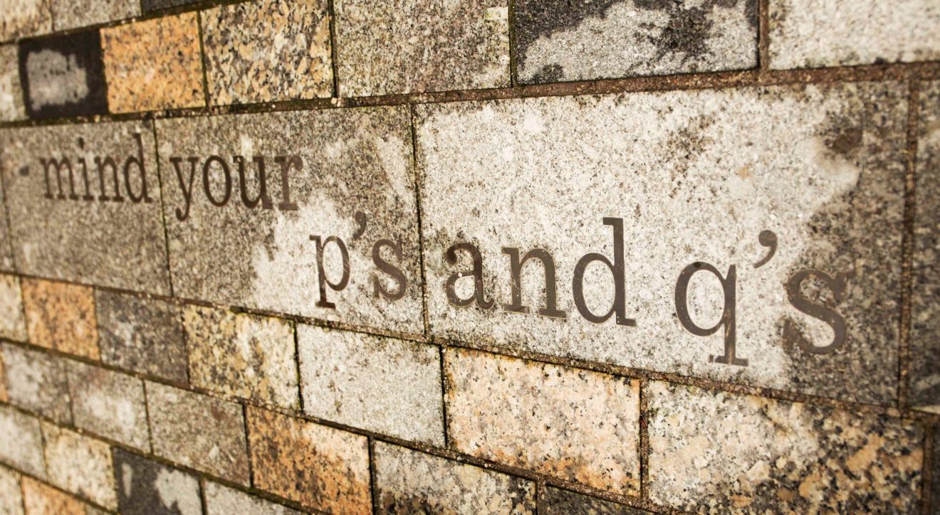
Mind your p’s and q’s
Now denoting to minding your manners, the origins though are from the fact that in relief printing letters are back to front, so a p looks like a q and vice versa. Printers had to warn their apprentices when distinguishing between the backward facing lowercase p’s and q’s which often led to confusion and errors.
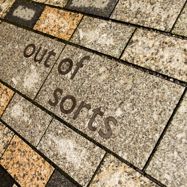
Out of sorts
For those moving in the printing world, a sort is another name for a single letter of type withing the type case. When you run out of lead type for that letter, you’re literally, out of sorts. This of course is very frustrating for compositors who would have been setting type by hand for several hours and now had to think about starting again with a new more full case of type. Nowadays, when we feel under the weather or a bit grumpy, we’re ‘out of sorts’.
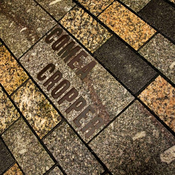
Come a Cropper
Come a Cropper is wildly held in the public’s imagination as derived from the very popular treadle platen press, the Cropper, which was very popular in Victorian times. Any printer who was unfortunate enough to catch his fingers painfully in the moving platen would come a cropper. Hence adopting the phrase is associated with an accident or unfortunate occurrence.
In the days of Everards as a letterpress printing company, lead type was set by hand and if a job, such as an advertisement was used more than once, the compositor (who set each letter by hand) may decide to make a stereotype, a moulded copy that would be kept for reprints.